

TRICARE Manuals Website Redesign
A Redesign of the TRICARE Manuals site for improved user experience
As the UX Designer, I conducted a heuristic evaluation, identified information architecture and 508-aware accessibility issues, and produced redesigned wireframes for key user flows. Methods used include heuristic evaluation, information architecture, and accessibility/508 awareness.
The Project’s Objective
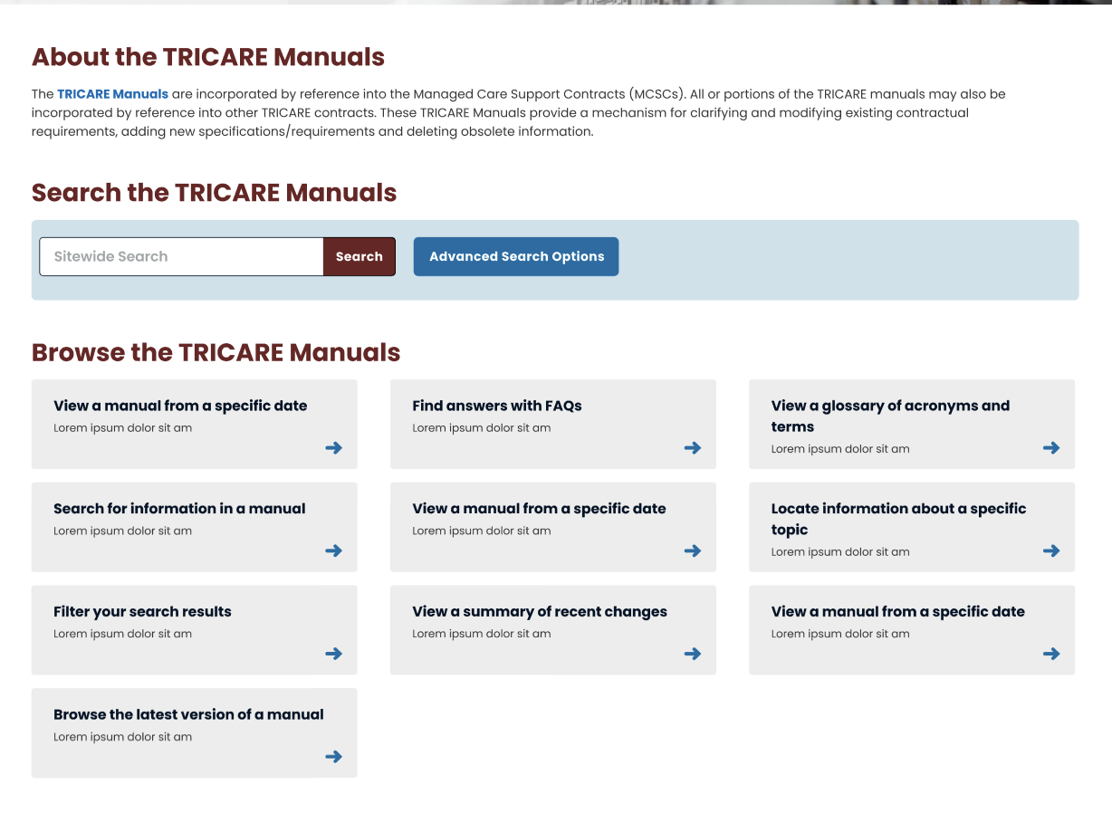
The original TRICARE Manuals site made content hard to locate due to a file-storage style hierarchy, weak visual hierarchy, and inconsistent patterns, so I created a concept redesign that clarifies the site’s purpose at first glance, standardizes layouts with reusable cards, and surfaces search and browsing paths to support faster, more accessible navigation
The Key Problems
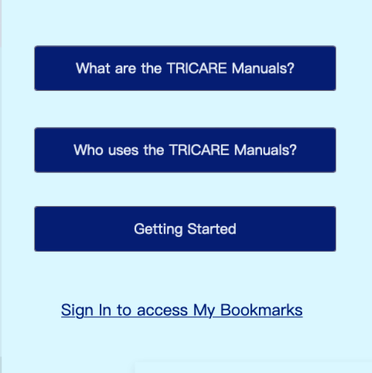
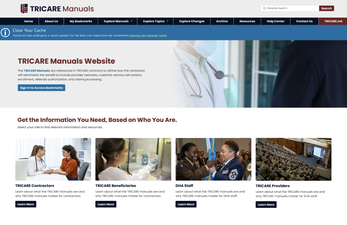
01 | Purpose wasn’t clear at first glance
The homepage didn’t communicate what the site is or what users can do there. Additionally, multiple call-to-actions led to the same hidden “about” destination.
Jump to solution.
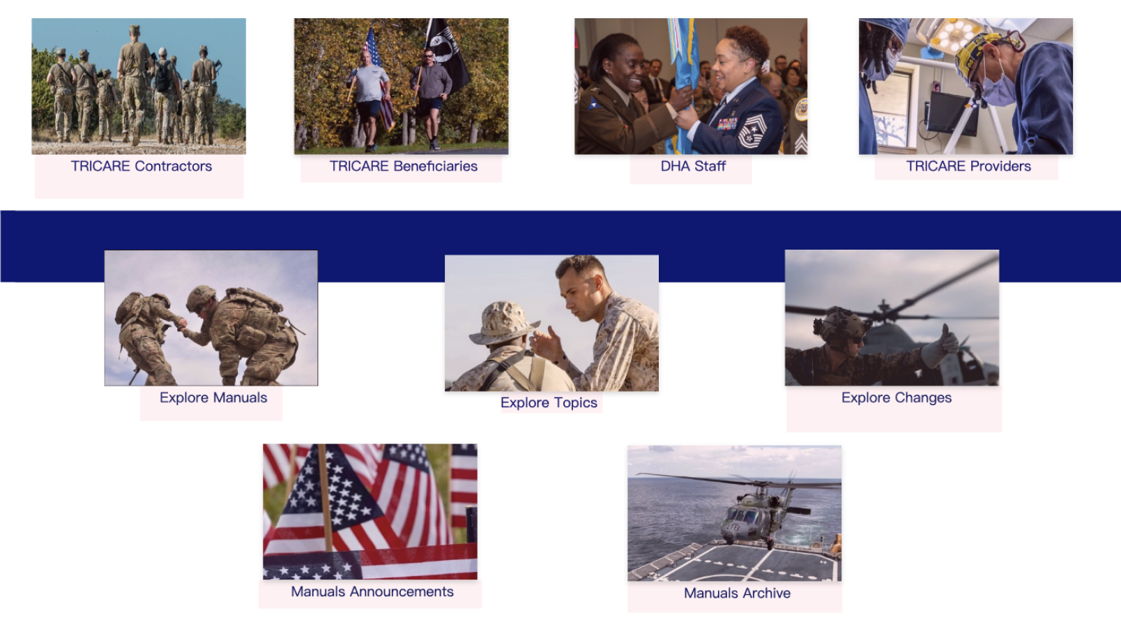
02 | Navigation felt like a personal storage file tree
The navigation looked and behaved like a personal file-storage tree, so content got buried and users lost their place in the hierarchy.
Jump to solution.
03 | Inconsistent card styles and spacing
Inconsistent layouts, padding, and content grouping made scanning difficult and created an uneven visual rhythm across pages.
Jump to solution.
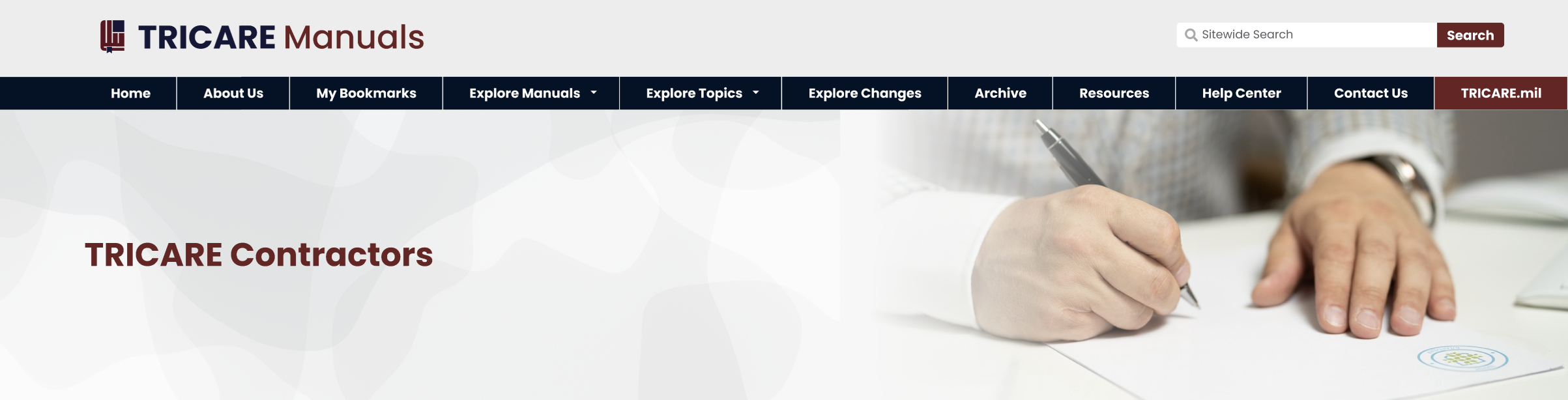
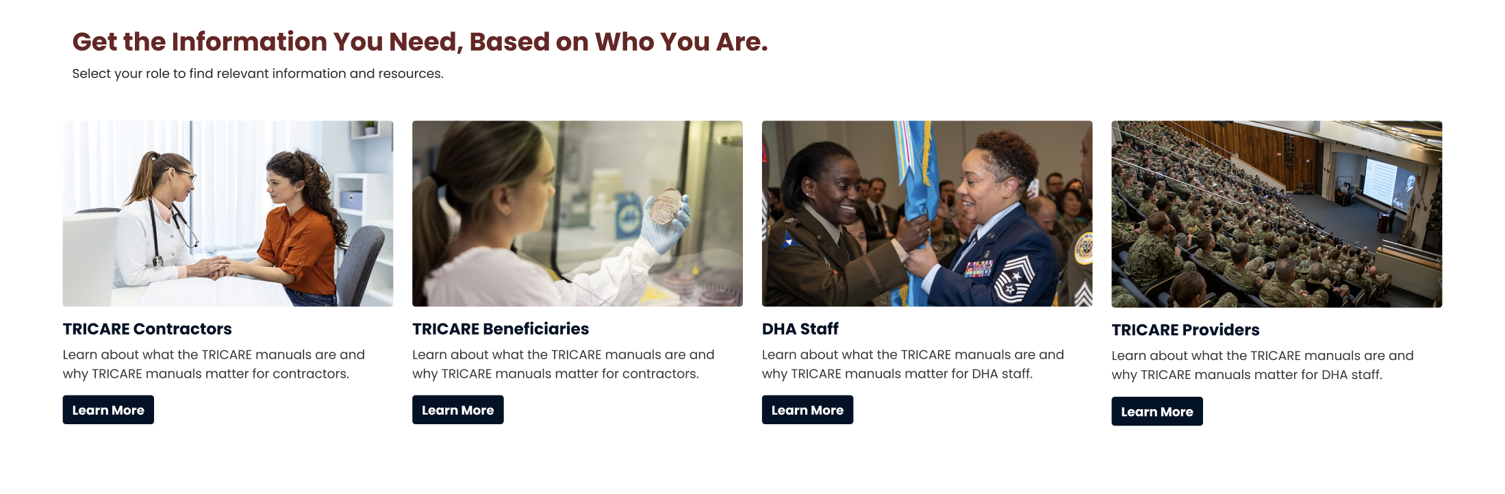
04 | Categories were visually unclear
Sections were separated in a way that implied confusing groupings (e.g., “audience vs webpages”), making it hard to tell what each category represented.
Jump to solution.
05 | Headings and buttons competed visually
Headings and buttons lacked clear visual distinction as they shared the same aesthetic design, and missing/unclear H1 structure created accessibility risk (508).
Jump to solution.
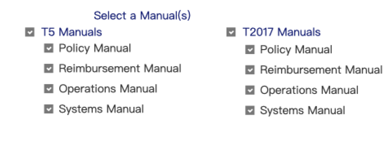
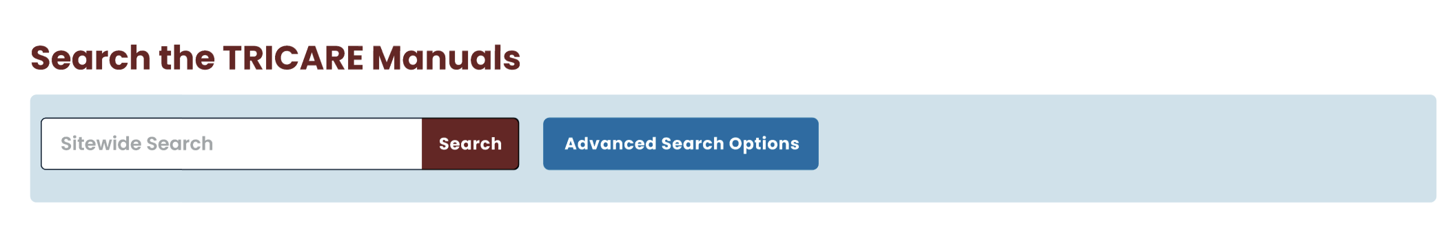
06 | Search options lacked prioritization and hierarchy
Search options were hard to differentiate and not visually prioritized, forcing users to remember where and how to search instead of recognizing the best path.
Jump to solution.
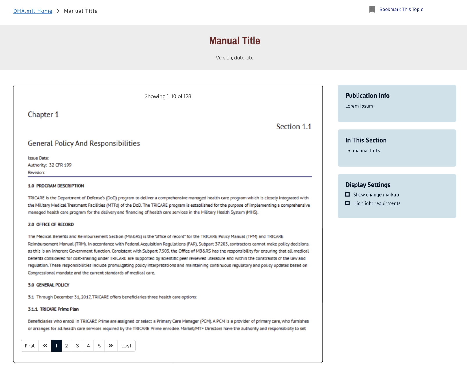
07 | Better wayfinding with a clear route to a manual
The interface didn’t clearly show the path to reach a manual, and it lacked wayfinding cues (like breadcrumbs) to help users retrace steps.
Jump to solution.


Now, let’s create some solutions!
The Key Solutions
01 | First-glance clarity: “What is this site?” is answered immediately
The homepage didn’t quickly communicate what the site is, who it’s for, or what users can accomplish there, and multiple CTAs felt redundant because they led to the same destination. Without first-glance clarity, users are forced to explore just to understand the site’s purpose. I added a clear H1 and a short purpose blurb, then streamlined entry points into more meaningful actions so users can orient themselves and choose a path within seconds.
02 | Navigation: From “file tree” to clear site structure
The original navigation resembled a personal file-storage system, which made content easy to bury and hard to retrace once users drilled down. This increased cognitive load because users had to remember where items “lived” in the hierarchy instead of recognizing clear pathways. I redesigned the navigation into a more familiar website structure with simplified top-level categories and clearer routes to key content, so users can browse confidently without getting lost.
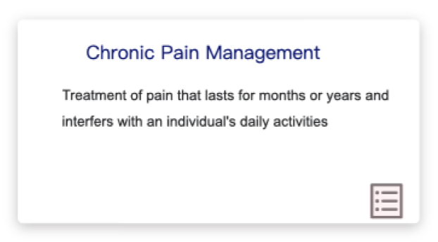
03 | Consistent card system and spacing
In the original design, inconsistent spacing and mixed content groupings made the layout feel uneven and harder to scan, especially when users were comparing multiple options. The lack of a consistent pattern also made the interface feel less like a cohesive system. The redesign introduces a standardized card format with predictable padding, typography, and CTA placement across pages. This consistency improves readability, reduces visual noise, and helps users quickly identify the next step.
04 | Clear labeling for categories and pathways
Some sections were separated in a way that implied confusing groupings, which made it unclear whether content was organized by audience, content type, or task. This created friction because users had to interpret the structure before they could navigate it. I replaced ambiguous dividers with explicit section labels and intent-based groupings that clearly signal the difference between role-based entry points and task-based exploration. The result is a clearer decision-making experience that supports faster browsing and fewer wrong turns.
05 | Stronger hierarchy + 508-aware structure
Headings and buttons competed visually in the original, weakening the page hierarchy and making it harder to distinguish what was a label versus a clickable action. Pages also risked accessibility issues when the heading structure wasn’t clearly defined—especially with missing or unclear H1 patterns. In the redesign, each page establishes a clear H1 and supporting headings, while CTAs are styled distinctly as buttons. This improves scannability, supports 508-aware structure, and makes interaction patterns more predictable.
06 | Search is more visible and usable (recognition over recall)
Search options were hard to differentiate and not visually prioritized, which forced users to guess which search path to use and remember where search lived across the experience. This violated recognition-over-recall and made searching feel more complicated than necessary. I brought search forward and organized search and browse options into clearly labeled modules with stronger hierarchy. This helps users quickly choose the right approach, understand filtering options, and find results without extra mental effort.
07 | Better wayfinding for clearer route to a manual
The original experience didn’t clearly show how users move from exploration to an actual manual, and it provided limited cues for how to navigate back once users reached deeper pages. Without strong wayfinding, users can feel stuck or unsure if they’re still on the right track. The redesign establishes a clear flow from Explore → Results → Manual Viewing and reinforces navigation expectations (like breadcrumbs or consistent backtracking patterns). This makes the end destination feel realistic and helps users move forward and backward with confidence.
The Usability Heuristics Implemented
Visibility of system status — clearer wayfinding patterns (e.g., breadcrumbs/backtracking expectations) so users know where they are.
Match between system and the real world — navigation and labels behave like a website (not a file cabinet), using familiar language and patterns.
Consistency and standards — standardized card layouts, spacing, headings, and CTAs across pages.
Recognition rather than recall — simplified IA, clearer categories, and more scannable pathways so users don’t have to “remember” where content lives.
Aesthetic and minimalist design — reduced visual noise, improved hierarchy, and cleaner grouping of search/browse options.
6. Error prevention — clearer labels/titles and improved structure reduce misclicks and wrong-path navigation.
7. Help users recognize, diagnose, and recover from errors — better backtracking/wayfinding support helps users recover when they choose the wrong route.
8. Help and documentation — improved Help Center organization into clear, task-based actions.
9. Accessibility / 508 (supports usability heuristics) — clear H1 structure, distinct headings vs buttons, complete/descriptive titles and labels.
Outcome
Overall, this redesign transforms the TRICARE Manuals experience from a file-storage style interface into a clearer, more accessible website that supports how people actually find policy information. By simplifying navigation, clarifying purpose at first glance, standardizing layouts with consistent cards, improving labeling and hierarchy (including 508-aware heading structure), and bringing search and wayfinding forward, the concept creates a more scannable and predictable path from homepage to an actual manual. The result is an experience that reduces cognitive load, improves findability, and helps users navigate confidently without relying on trial-and-error.