

Pain and Opioid Safety Application
A Redesign of a Defense Health Agency (DHA) Mobile Application
This case study outlines the user research conducted for the Pain and Opioid Safety app, designed to support veteran health. It walks through the end-to-end UX process—from initial user research and discovery to the final delivery of wireframes to developers.
Note: Some information is omitted for confidentiality purposes.
Application Background
The Pain and Opioid Safety Application allows patients to record their pain levels, track daily activities, and provide information about health-related tasks. This case study aims to showcase the main improvements to the content and functionality of this app, enhancing the experience of tracking health information for both patients and healthcare providers.
01 | User Research
The first step in the process was participant recruitment, resulting in a group of six users. We conducted remote usability sessions where participants were guided through the app to identify pain points, gather feedback, and understand user needs. I alternated between conducting the sessions and observing to take detailed notes and capture insights.
02 | Data Analysis
Step 1 - Acquire Participant Data

Step 2 - Sort by Type of Data

Step 3 - Group Patterns
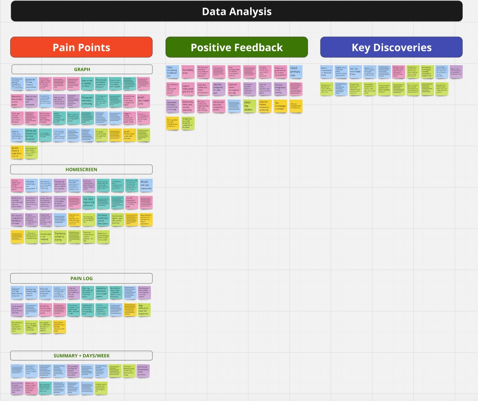
Step 3 - Consolidate Findings
03 | Identify Areas for Improvement
Let’s break down some of the main pain points
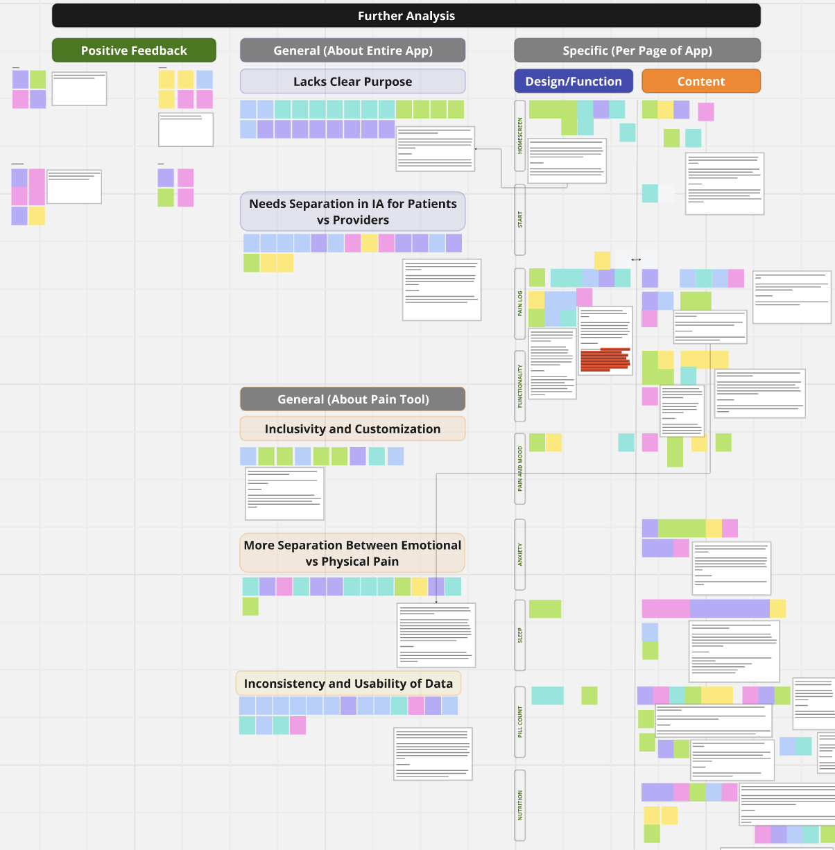
Pain Point 2 - Unclear Survey Questions and Instructions
We found that participants stated that some functions felt missing to complete the health assessment found within the app. An example of a missing function would be not finding a ‘clear’ button for answers.
On a similar note, participants wanted to separate physical and emotional pain questions on different screens and suggested placing physical pain immediately after logging points for better flow.
Also related to content, there were several questions on the survey which were interpreted in different ways, which could lead to inaccurate data collection, such as:
Participants expressed not knowing if the phrase ‘medication count’ meant the count of different types of medications prescribed or the actual pill dosage they take.
Some participants did not know how to answer a question about how much sugar they intake a day, as they did not have that knowledge readily available.
Pain Point 3 - The Data is Hard for Users to Digest
We found that when users reached the last screen - a graph displaying their data entered - all of them felt that the graph did not convey information in a clear way and even struggled to recognize it as a graph.
Most participants did not know what data of theirs was presented in the graph and were confused about what data was included.
Some participants wanted consistency in data collection and presentation, as data alternated between daily and weekly formats. They wanted clarification of these metrics to interpret its meaning of the results and facilitate actionable insights.
If the data is not presented in a clear and usable way, it creates a feeling of frustration and can lead to thoughts such as: “why did I even take the time to use this app?”
Pain Point 1 - The Application Lacked Clear Purpose and Audience Distinction
We found that some participants felt that the app's home screen and features did not clearly communicate its purpose.
This had a result of users feeling ‘lost’ on the homepage, unsure of what action to do next.
This explains bounce rates on the home screen being high, as participants willingly mentioned that they found it both confusing and not engaging.
Additionally, the study concluded that most participants wanted to see a clearer separation between the content that is meant for providers versus the content that is meant for the patients.
This results in further confusion in navigating the app, and higher bounce rates when a user is unable to find what they need in a suitable amount of time.
04 | Creating Solutions
Pain Point 1 - The Application Lacked Clear Purpose and Audience Distinction

Recommendation
We added a clear statement on the home screen that outlines the purpose of the application. Additionally, we redesigned the home screen to distinguish content paths by making a clear landing point for patients vs providers.
Improvements
The mission statement is displayed on the home screen to help users understand the purpose of the Pain and Opioid Safety application.
Including headings like “Mission Statement,” “For the Patient,” and “For the Provider” enhances the clarity of the information architecture for users and groups functions by category.
Having the buttons be more pronounced and engaging gives a sense of direction in the app.
Pain Point 2 - Unclear Survey Questions and Instructions
Improvements
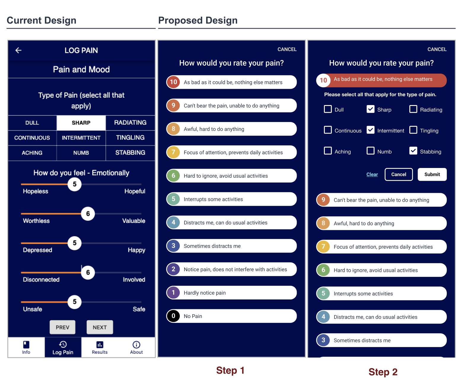
Each content improvement is on a question-by-question basis. In this example, the image to the left shows an example of how we made the health survey assessment more intuitive by enhancing the user flow by rearranging questions so that users do not need to actively recall information. We made sure all questions had clear formatting with examples when needed.
Pain Point 3 - The Data is Hard for Users to Digest

Improvements
Data was presented in a more clear, usable way by:
Standardizing and labeling data presentations daily or weekly in the app to ensure accuracy and support actionable insights. Make sure the summary and graph states whether it is daily or weekly.
Ensuring that all of the information provided by the user in the ‘Pain Assessment Tool’, like nutrition, gets properly represented on the graph.
Adding an X-axis that displays the time, and a Y-axis that displays the severity out of 10, and to make sure the points on the graph align properly with these two variables.
Outcome
Once the wireframes were finalized, they were translated into high-fidelity designs, fully prepared for handoff to developers. A UX review was conducted to ensure design consistency, usability, and readiness for production, supporting the release of an enhanced version of the app.