

A collaborative effort by my team and I to build a scalable, accessible design system supporting multiple Department of Defense health platforms.
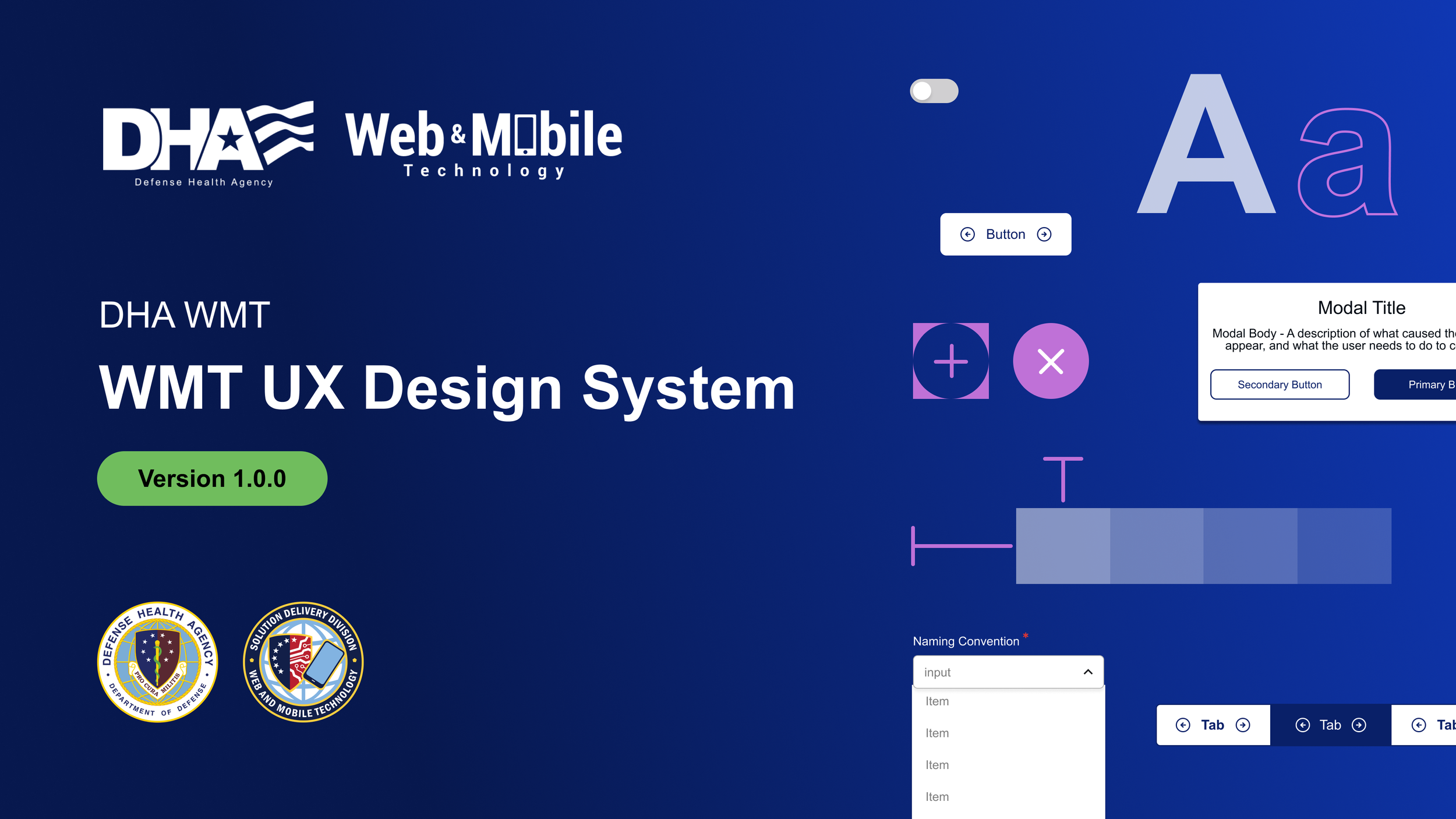
DHA Design System
Purpose of the DHA Design System
The DHA Design System was created in Figma to give our team a
shared foundation for designing across multiple Department of Defense health platforms.
It helps designers and developers stay aligned by providing consistent patterns, accessibility guidance, and reusable building blocks.
Having everything in one place makes collaboration smoother, cuts down on repeated work, and allows teams to move faster while still meeting strict accessibility and usability standards.
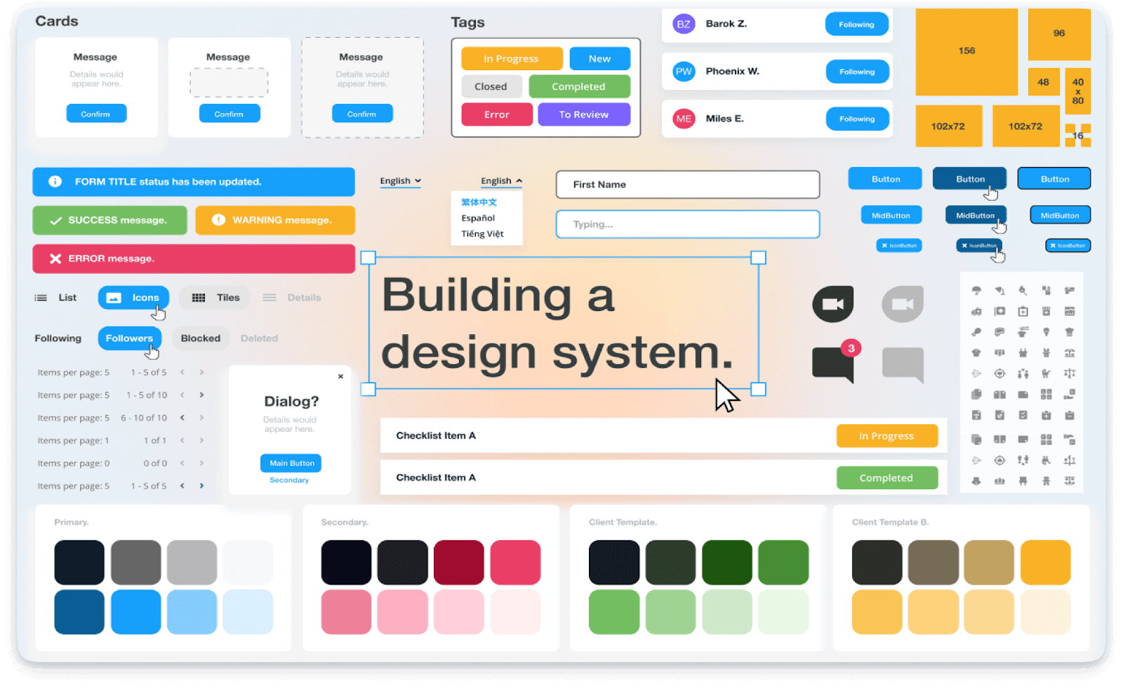
Components & the Craft Behind Them
At the core of the system is a growing library of reusable components such as navigation, forms, buttons, tables, cards, alerts, and search patterns that teams use every day.
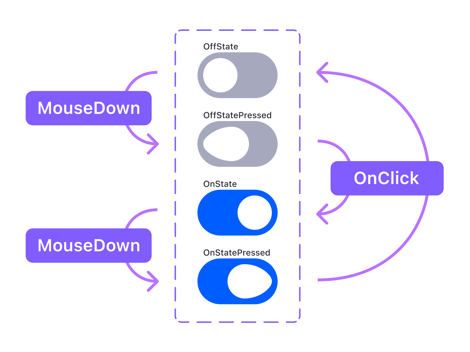
Each component was built to be flexible enough to work across different layouts and content needs without forcing designers to start from scratch. A large part of the work lives in the details inside Figma, like setting up auto layout correctly, managing variants and properties, and keeping naming clear so components are easy to find and use. Beyond the tooling itself, the bigger challenge is thinking through real-world edge cases including accessibility states, varying content lengths, and responsive behavior so the components hold up when multiple teams rely on them in production.
Design Tokens & System Foundations
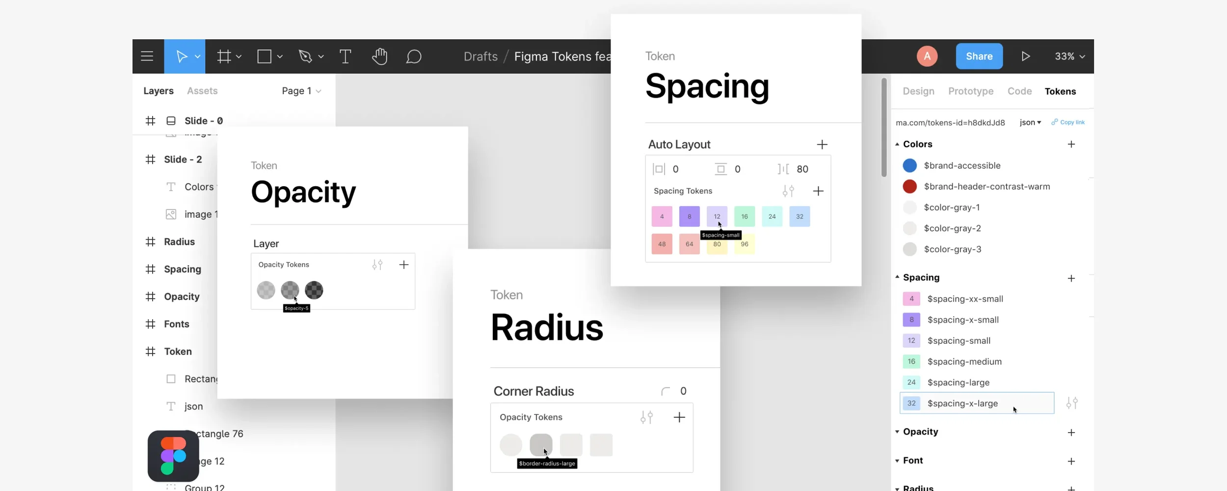
Design tokens are what keep everything consistent across the system. We used them in components, layouts, typography, color styles, and interaction states so changes could be made once and flow everywhere else. This made it easier to keep designs consistent and aligned across teams.
Designing for Different Platforms
Rather than forcing a one-size-fits-all solution, the DHA Design System is intentionally split into three distinct but aligned libraries: Health.mil, TRICARE.mil, and the DHA Mobile Application Library. Each system is tailored to its platform’s audience, content needs, and interaction patterns while still adhering to shared design principles and accessibility standards.

The Impact of the Design System
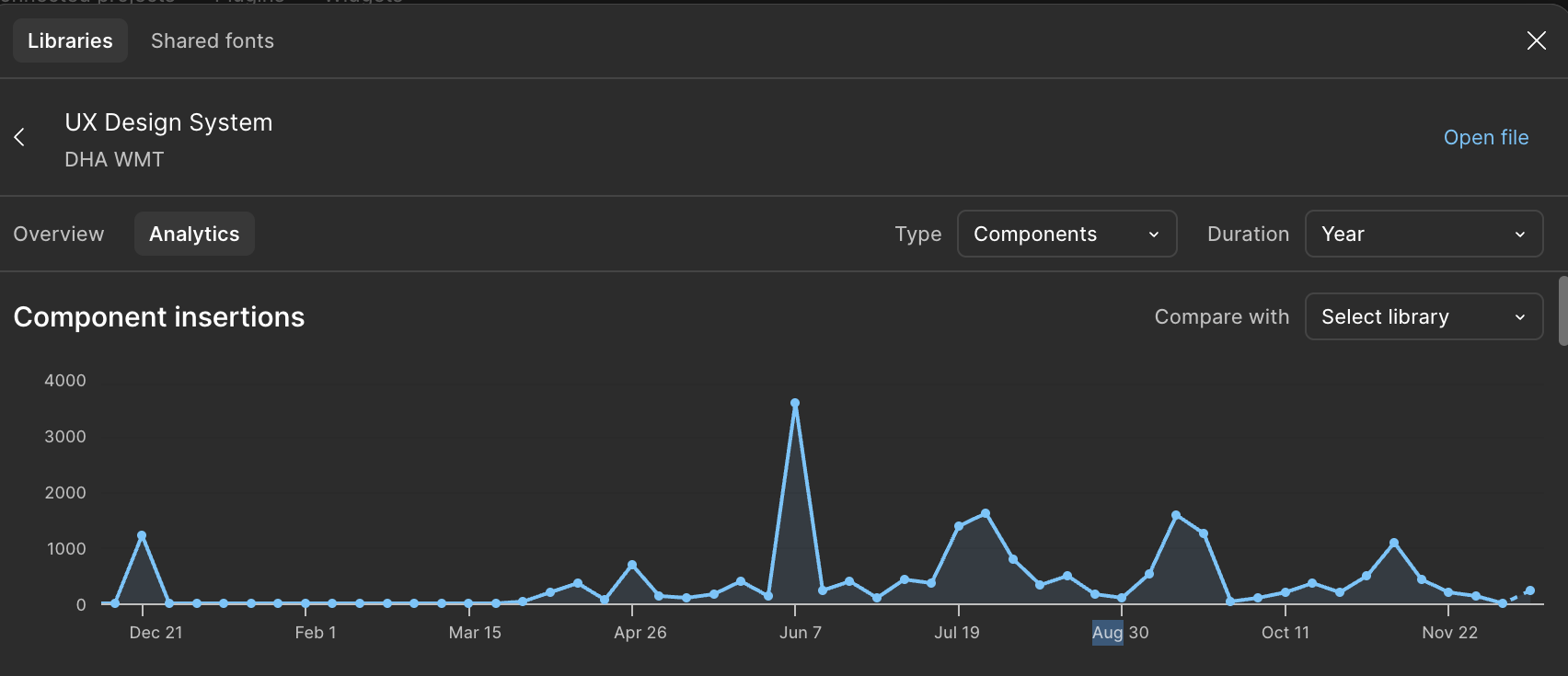
The system’s impact is reflected in its adoption metrics. Over the course of the year, the design system recorded thousands of component insertions, with clear spikes during major design initiatives and product pushes.
These analytics validate the system’s effectiveness as a shared resource: it is trusted, widely used, and embedded into team workflows, supporting consistency, speeding delivery, and reinforcing high design standards across DHA products.